Have you been trying to trade but just can’t seem to get it right?
If you’re thinking about trading, or even if you are a seasoned day trader, it's hard to know exactly where to start.
You have to look at all the aspects of trading. The market can go sideways, go higher or even lower. It can go against you anytime.
To consistently beat the market, you have to equip yourself with the right knowledge (and the right tools).
The tools here are technical indicators we use every day to predict the market.
Well, trading is a lot easier than you think, and there’s no need to make up complicated indicators to succeed.
In this article, I’m super excited to share with you my foolproof combination of indicators that will tell you exactly whether it’s time to buy, sell, or hold.
Sounds interesting? Read on...
The Best Combination of Indicators for Day Trading
There’s a good chance that you’ve heard a lot about indicators before, but you don’t know how they work, and you don’t know which ones are the most effective.
I’ve been trading for over 11 years now...
When I first started, there were only a handful of indicators that would work.
Then more indicators came along, until the market was flooded with indicators. Then I began looking at what worked best for me… and what didn’t.
So what are the best indicators for trading?
The answer is simple!
I have to find an indicator that WORKS FOR ME!
Determining which indicators are right for you depends on what type of trader you are, as well as the specific market you are trading in.
There is no “right” or “wrong” way to trade, really. It all boils down to what will work best for your personality and style.
I’ve used and tested dozens of indicators over the years. But I know, in my heart, what indicator really gives you the best chance of success.
That’s why I put together this trading guide to help you cut through the clutter and find the one indicator that really WORKS FOR YOU!
If you have the right tools and the right strategies, you can make huge profits every single day from the market.
Now let’s dive in one by one...
Free Download
How to Beat The Market in 2023 & Beyond!
With Little-Know Trading Strategies and Hacks Included!

Support and Resistance
First, let’s talk about support and resistance...
This is the most important thing you will ever learn about trading!
Support levels act as barriers that keep the price from falling, while resistance acts like walls that prevent prices from rising.
When you see these lines, you should be careful because throwbacks and pullbacks might happen at those points in time.
When you see a stock is trading at a support level, you can buy there without fear, as the price is unlikely to break through that level as it has in the past.
When you see the price is reaching to a resistance level, you may sell your shares or go short because it’s unlikely to break that point as it has in the past.
The theory sounds easy, but in practice it’s a different story.
I know you can’t get your head around this stuff, as you don’t know where to start drawing those lines on a chart.
But don’t worry - I’ve got you covered!
You can follow the steps below to draw support and resistance lines in TradingView.
Step 1: Identify all the highs and lows you can find on the chart.
You can use the TradingView's built-in annotation tool to add Arrow Mark Ups and Downs, as follows:
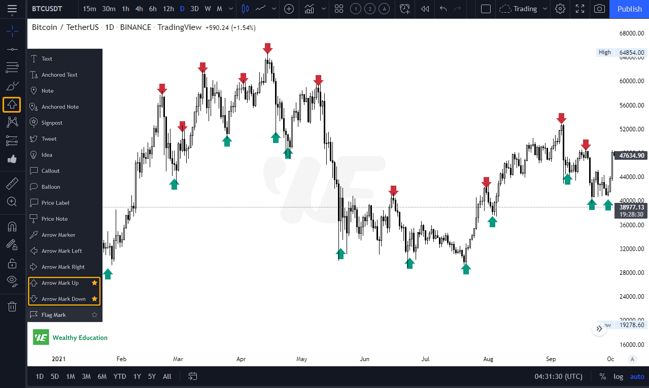
What I want you to do now is to pay attention swing highs and swing lows on the chart.
Step 2: Draw 2 horizontal lines at the peak and trough.
Next, you can use the Line Tool to plot 2 horizontal lines at the highest and lowest price points.
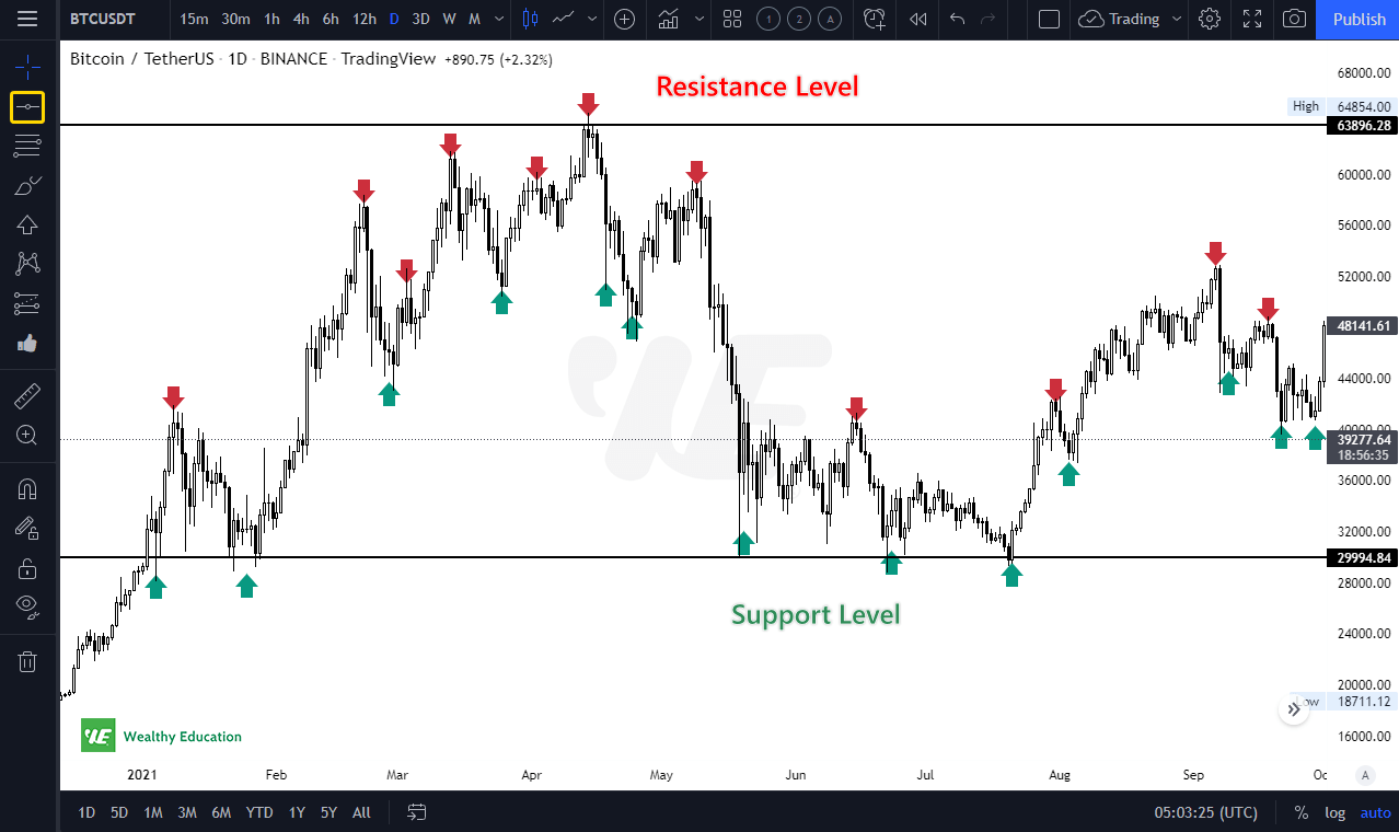
Once you do, you will see a price range, as shown on the chart above.
Here's a hint: There's no strict rule for drawing support and resistance lines. You want to draw a line that cuts as many candle wicks as possible.
The upper line is a strong resistance level because the price failed to rise further and dropped dramatically after a few attempts (on lower time frames).
The lower line is a strong support level because when the price hit that level, it failed to drop further, but instead went up quickly.
Step 3: Find areas where prices touched multiple times in the past.
Now it's time to watch the chart closely to identify valid support and resistance levels.
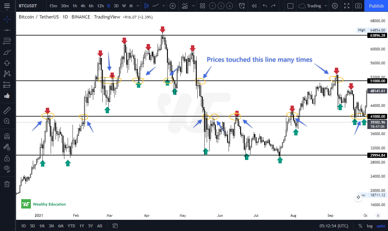
You can use the Horizontal Line tool to connect other highs and lows.
If the price has touched a horizontal line multiple times in the past and failed to break up through it, you can consider it a strong resistance level.
Similarly, if the price has failed to break down through a horizontal line at least 2-3 times in the past, you can consider it a support level.
As you can see on the chart, we have 2 additional strong support and resistance levels at around $41k and $51k.
By connecting other highs and lows, you will find that we have some minor support and resistance levels here at around $45k and $58k (blue lines).
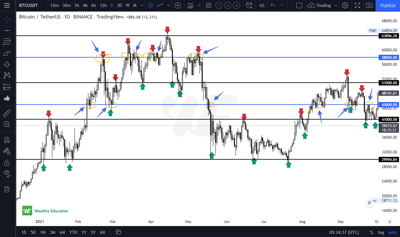
These support and resistance levels can be seen clearer on lower time frames, such as H4 and M15.
Looking at lower time frames (i.e. H1 and H4), you will find that we have more touches at $45k and $58k.
And the strategy?
We’ll consider buying or going long when prices are at support levels. If the market goes against us, we’ll stop loss when the candle closes below the support level.
Similarly, we’ll consider selling or going short when prices are near resistance levels. If the price breaks up to the upside, we’ll close our trade when the candle closes above the resistance level.
And here's a quick note:
Support and resistance levels on longer time frames (i.e. D1 and W1) tend to be stronger than those on shorter time frames (i.e. H4, H1, M15).
So when analyzing a stock chart, you will need to pay attention to longer time frames first to determine the current market trend.
Fibonacci Retracements
You may have heard a lot about Fibonacci retracements, but have you ever seen how professional traders use this tool to predict the market?
Fibonacci is a simple yet powerful technical analysis technique to identify support and resistance levels in the market.
Looking at Fibonacci ratios will help you get an idea of what price will complete the next move up or down.
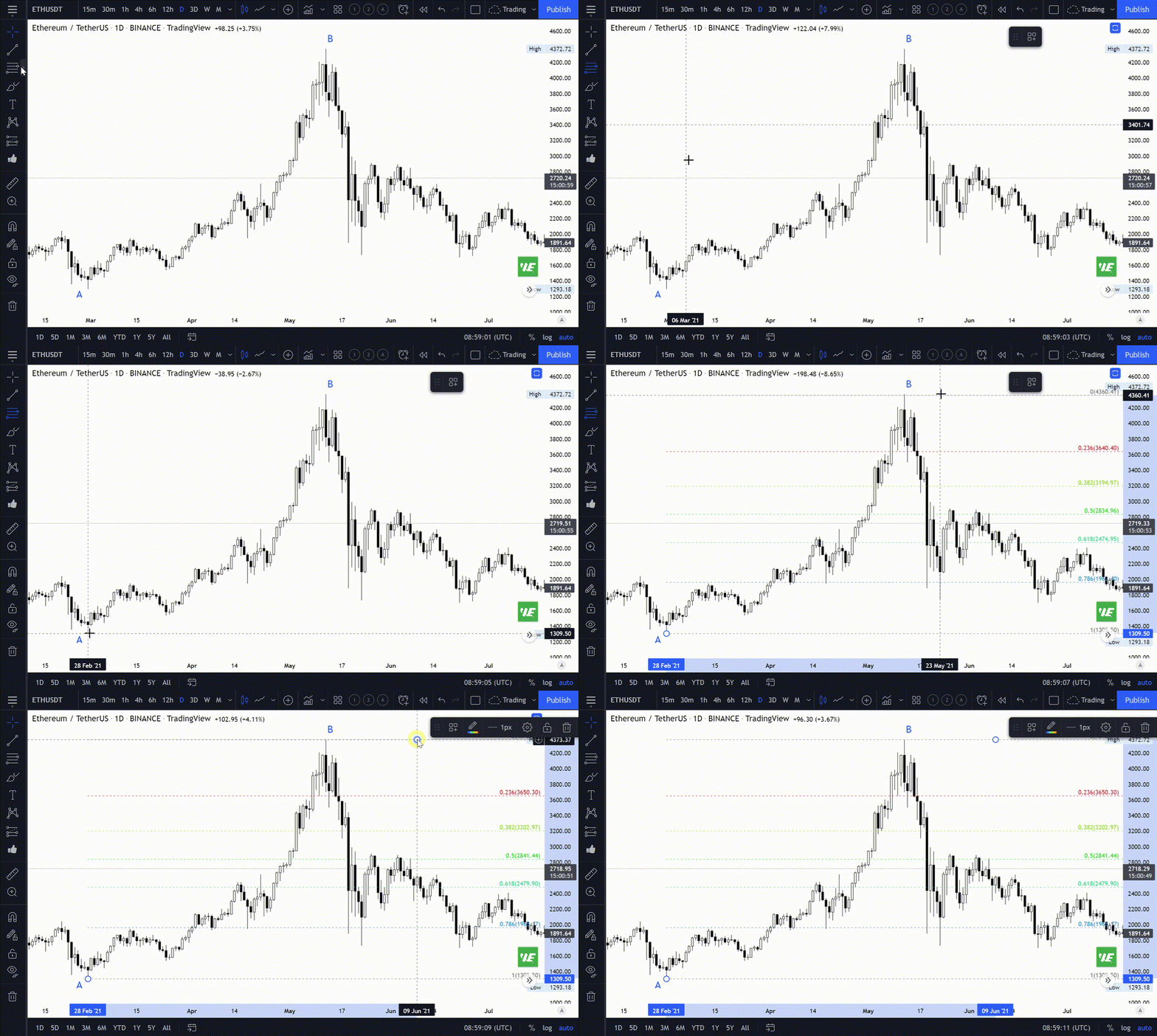
In order to add Fibonacci retracements in TradingView, you can click on the “Gann and Fibonacci Tools” button on the left-hand side. You’ll then find the Fibonacci Retracement tool.
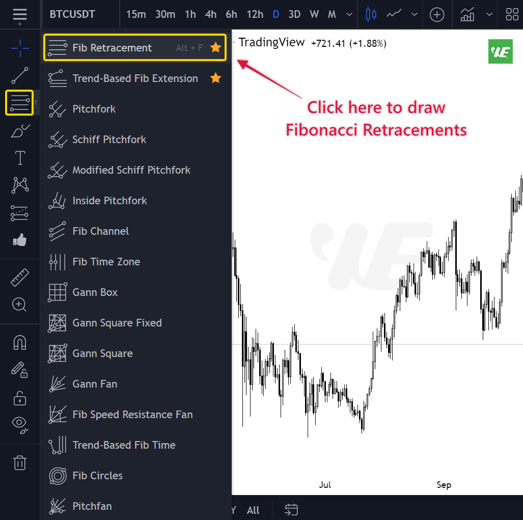
Look at your chart and identify the most recent swing high or swing low. For example, if the market is trending up, you can use the swing high to draw a Fibonacci retracement.
Simply place the tool at the lowest point of the trend (point A) and drag it up to its peak (point B).

FYI, the Fibonacci sequence is a sequence of numbers (0, 1, 1, 2, 3, 5, 8, 13…) that is defined by the following rule: each number is the sum of the two preceding ones.
Fibonacci retracements are a series of lines that extend across the price action to show when Fibonacci levels have been reached.
These horizontal lines show areas where sellers make a fight with buyers, which can either cause consolidation or divergences in momentum depending on whether they coincide with points of resistance or support.
I don’t talk too much about theory here, but I want you to pay attention to the 0.50 (or 50%) and 0.618 (or 61.8%) level because these are golden ratios.
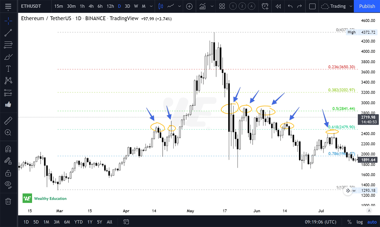
This works just like magic... somehow prices tend to react strongly at these levels. So we can consider the 0.50 and 0.618 to be strong support and resistance levels.
What I like most is the 50% level...
If the market trades below the 50% level, there is a good chance that it will rebound back to this level.
On the other hand, if the market rises above the 50% level, the market tends to move back down to the 50% level, creating a new base from which the market can move back up.
So the strategy is... we’ll consider buying (or selling) when the price is right above (or below) the 50% level, and we’ll take a quick profit when it reaches the next Fib level.
Exponential Moving Averages (EMA)
What is an EMA? - That’s a great question!
I’m glad you asked because the answer is a lot simpler than you might think!
And once you know it, you’ll be able to use this powerful tool in so many different situations...
I’m not sure that anyone else has ever explained the concept of EMAs so well as I have.
I have tried to explain it to 100,000+ students of the WealthyEducation’s Academy by saying “EMAs are like a clock that keeps track of your past performance, and then moves the hands forward based on your performance.”
However, that is really only one way to think about EMA.
Exponential Moving Averages give us a simple way to average a series of prices over time, making it easy to see the average price in relation to the current price.
The idea behind this indicator is to show trend changes by smoothing out the volatility in the market. It can help you find out exactly if the overall trend is up or down.
I’ve been using EMAs in all my trading and investing for years and here’s why:
- It’s used by a lot of traders, so trading signals are more robust. When it comes to trading, it’s worth following the crowd to understand their behavior
- It helps me instantly identify strong support and resistance levels (There’s a trick, and I’ll show you in a minute)
- It helps me see market trends and chart patterns more clearly
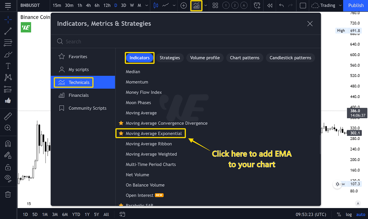
To add Exponential Moving Averages in TradingView, you can click on the "Indicators, Metrics, Strategies" button at the middle top of the screen.
Select "Technicals" and then scroll down until you find "Moving Average Exponential".
So what’s the right way to use Exponential Moving Averages?
I prefer to use EMA 20 (Blue), EMA 50 (Orange) and EMA 200 (Black) for analyzing the market because these EMAs work perfectly well for me.
I will first look at longer time frames, such as 1-week and 1-day charts, to determine the current market trend. Then, I will trade on the shorter time frames.
If prices are trading above the moving averages, the market is trending upwards. On the other hand, if prices are below the moving averages, the market is trending downward.
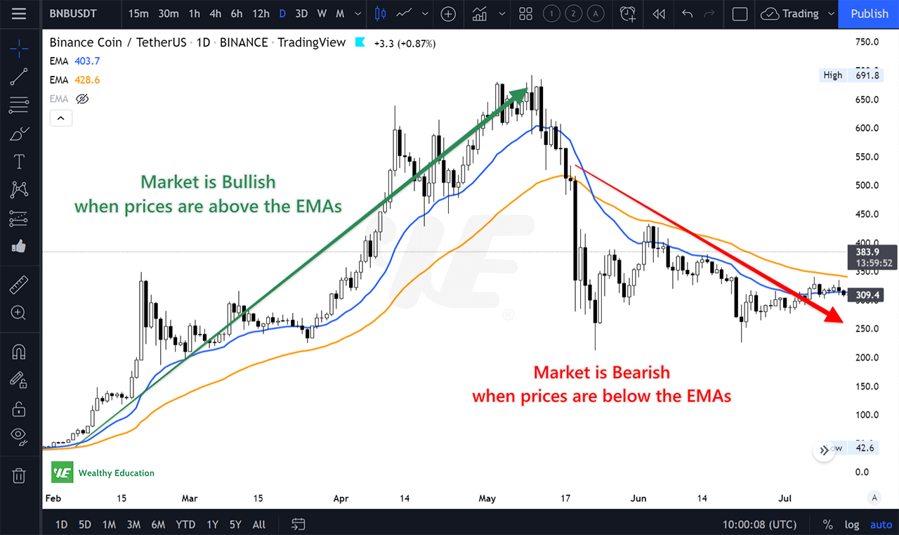
Moving average lines also act as dynamic support and resistance levels. If you can take advantage of this, you can make consistent profits from the market.
Here’s my personal experience...
When we’re in an uptrend, prices tend to throw back to test the EMA 50 and EMA 200 before going back up.
When we’re in a downtrend, prices tend to pull back to test the EMA 50 and EMA 200 before dropping further.
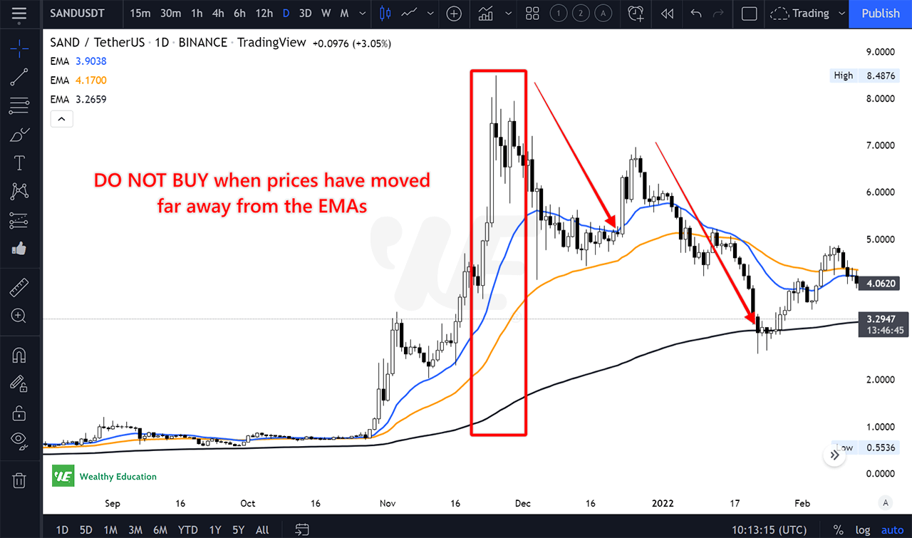
Here's quick note: DO NOT buy or sell when prices have moved far away from the EMA lines. This is a good way to lose money!
And here’s a trick...
We’ll only get in the market when prices throw back to the EMA 50 or EMA 200 line. However, we’ll want to wait until there’s a confirmation candle. This can be a hammer, a doji star, or a one-white soldier candlestick.
At this point, I will place a buy order at a price which is right above the confirmation candle.
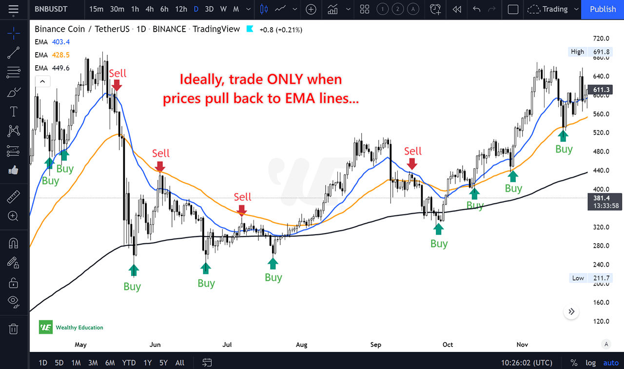
Similarly, we’ll consider selling or going short when prices go back up and hit the EMA 50 or EMA 200 line. Again, we’ll need to wait for a confirmation candle.
Once the confirmation candle has formed, I will place a sell order at below that candle’s wick.
Moving Average Convergence Divergence (MACD)
If you’re looking for an indicator that will help you measure market momentum and spot trend reversals, this is a great one!
Moving Average Convergence Divergence (MACD) is a trend-following indicator that shows the relationship between two moving averages of prices.
You can use this indicator to detect possible changes in the strength, direction, duration, and momentum of a trend.
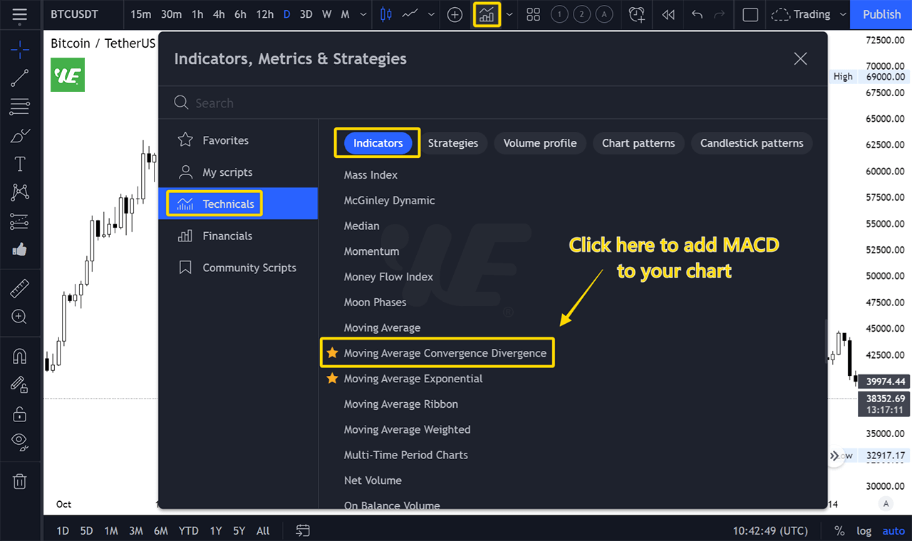
To add the MACD oscillator in TradingView, you can click on the "Indicators, Metrics, Strategies" button on the top menu.
Select "Technicals" and then scroll down until you find "Moving Average Convergence Divergence"
The MACD consists of two lines: MACD Line and Signal Line.
When these lines are slopping up, it means the overall market is bullish. When they are slopping down, it means the market is bearish.
Now, what I want you to pay attention to is... the Zero Line.
After slopping down for a while, if the MACD lines start to cross up through the Zero line, we can consider this a signal for an upcoming trend reversal.
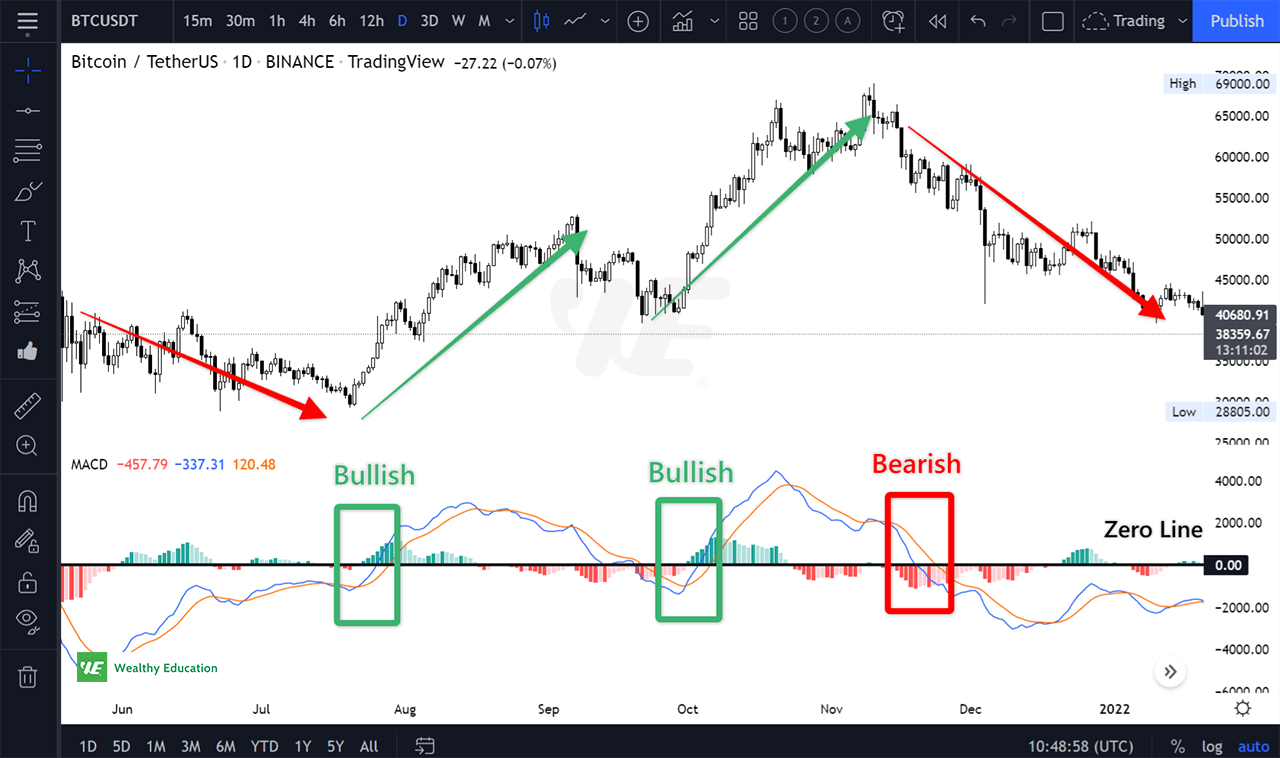
And vice versa, if the MACD lines cross from above to below the Zero line, we know that the market will turn bearish soon.
There’s a few different ways to use MACD in trading. But if you want an easy (and most profitable) way to get started, there you go...
I love to trade trend reversals by looking for MACD divergences on a chart.
Looking at divergence patterns is a good way to tell if a trend is going to reverse or continue its course.
The divergence pattern describes how two or more indicators are moving together. The difference between these indicators can be diverging, converging, or parallel.
Most of the time, the MACD and prices will go parallel with each other.
But when there’s a divergence (or convergence), we need to be careful because this is a powerful signal that the trend is about to reverse.
Divergence

When the market is going up and I find a divergence between prices and MACD, I will consider going short because I know that the price will drop shortly.
Convergence
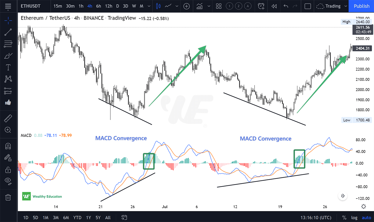
When the market is trending down and there’s a MACD convergence on a chart, I will consider going long because this is a strong signal that the trend is going to reverse.
If you notice, you'll find that the MACD also crossed above the Zero Line, which indicates a bullish momentum. We could predict that the price would go up shortly.
Relative Strength Index (RSI)
This is a must-have tool for ALL traders and investors.
It’s called RSI because it measures “Relative Strength”, which is based on past performance and the current performance.
But unlike most other indicators, this indicator looks at the direction of the price movement as well as the magnitude.
I’ve been using the RSI indicator for over 10 years now. It helps me instantly determine overbought and oversold conditions of the market.
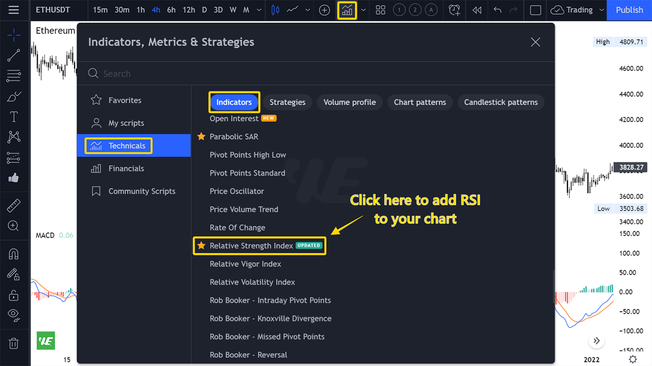
Now let's add the RSI oscillator by clicking on the "Indicators, Metrics, Strategies" button.
Simply type "Relative Strength Index" in the search box and then add it to your chart.
The RSI ranges from 0 to 100. When an asset falls below the 30 level, it’s considered oversold. When an asset rises above the 70 level, it’s been overbought.
So the strategy is... we’ll buy when the RSI is below 30, and we’ll sell when the RSI is over 70. It’s pretty straightforward!
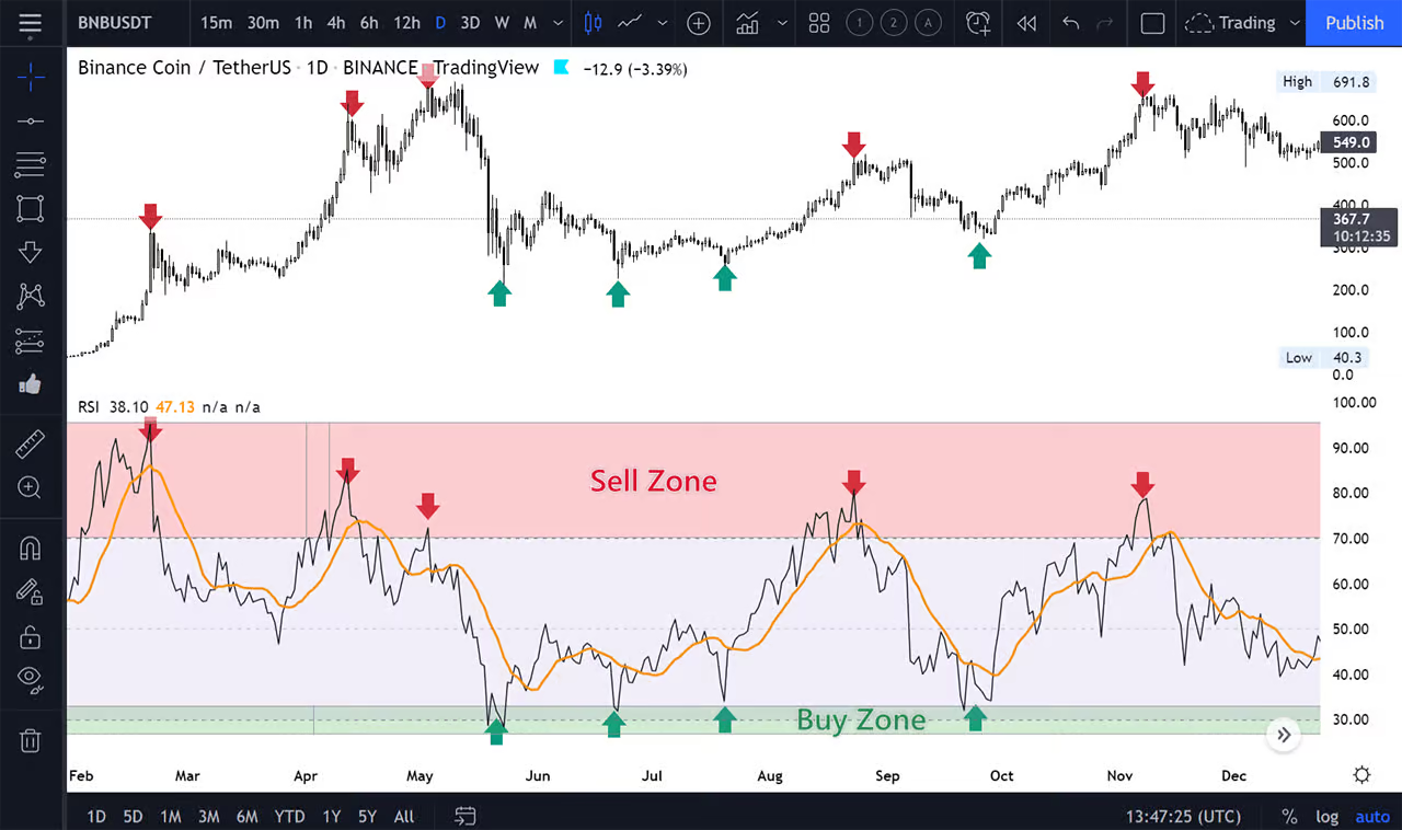
And of course, there’s another (and more profitable) way to trade RSI.
Similar to the MACD, I will look for RSI divergences (and convergences) on a chart. I love using this strategy to spot upcoming market corrections and trend reversals.
Divergence
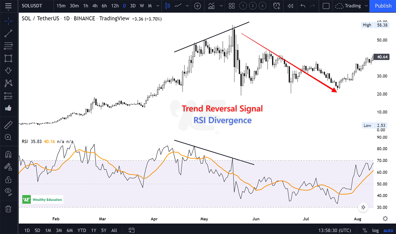
When we’re in an uptrend and there’s a RSI divergence on a chart, it’s time to sell because we know the trend is about to reverse.
The divergence shows a sign of momentum loss. Even when the price keeps going up, no more buyers are entering the market, which causes the RSI to drop.
Convergence
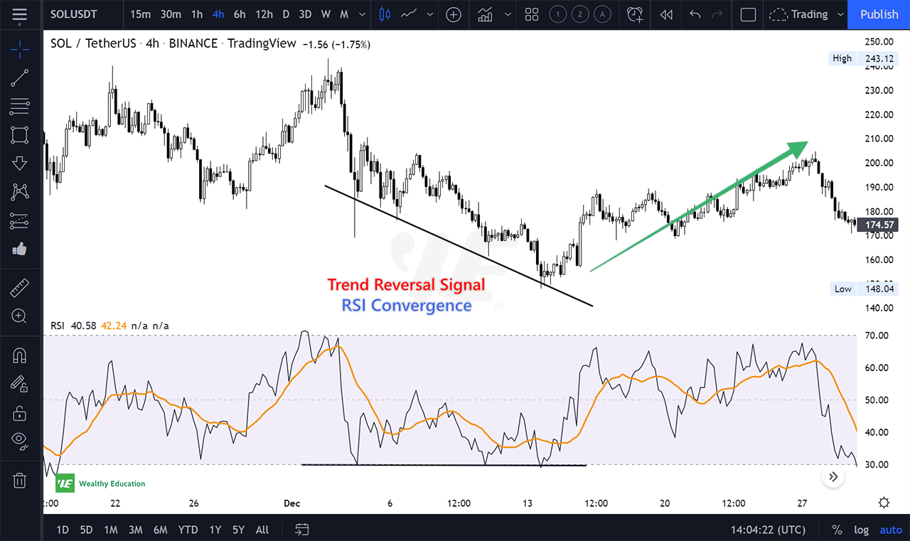
Similarly, we’ll buy or go long when we’re in a downtrend and we find a convergence between prices and RSI.
The divergence happens because more traders are entering the market to buy the dips, which leads the RSI to rise. This is a strong signal that the downtrend has ended and the price will go back up shortly.
What Are The Best Chart Time Frames to Trade?
Well, this is downright confusing...
We’ve all been there before. You open up the computer and start looking at your favorite charts to trade. Then you realize you don’t know which time frame you should be using.
I know you’re sick of chart time frames right now - I’m sick of them too!
Choosing a chart time frame is a crucial step at the beginning of your trading journey.
But once you figure out what works for you, it can make the difference between a successful trade and a failed trade.
So what’s the best chart time frame?
I get this question ALL THE TIME! The truth is, there’s no perfect chart time frame to trade.
Please keep this in mind: the longer the time frame, the less volatile the market will be. The shorter the time frame, the more volatile the market will be.
I personally use W1, D1, H4, H1 and M15 charts. I will first look at the W1 and D1 charts to see the overall market trend and then trade based on the H4, H1, and M15 charts.
If I want to go long, I’ll make sure that the D1 and W1 charts show uptrend signals. Then, I’ll look at lower time frames (i.e. H4 and H1) to determine a good entry point for my trade.
Sometimes, looking at other chart time frames like H6, H12, and D3 is also very helpful.
For example, you look at the 4-hour chart and you find that the stock is in an uptrend. But when you look at the 1-day chart, it does not show a clear signal.
What you can do now is to look at H6 and H12 charts. If the stock is trending up, these charts will show uptrend signals before the D1 chart.
This way you can be more confident with your trading decision.
Final Words
Traders always ask “What are the best indicators?” - I tell them the best indicators are the ones that WORK FOR YOU! (not for me, and not for anyone else!)
Don’t use more than 3 indicators on a single chart.
If you have more than three, you are making the same mistake most traders make. They try to make a trade out of every piece of news they can find.
When you have too many indicators, it’s hard for you to know which one is reliable, and you’ll end up chasing too many things.
Trust me, that’s not a good way to trade!
So I would recommend you test every indicator yourself on a paper trading account and find the top 3 most effective ones that work for your trading needs.
For example, I personally use EMA, MACD, and either RSI or Stochastic for most of my trading.
This way I can not only prevent myself from spending too much time analyzing charts, but also eliminate a bunch of market noises and false signals.
I hope you’ve enjoyed this article. If you want to learn more about trading strategies that actually work, you can check out our courses here.


